Used generously or even sparingly, infographics can convey information clearly and in a matter of moments.
Project 1 Highlight: Fisheries and Oceans Canada Aquaculture Reports
Layout and design of reports in both French and English.
Project 2 Highlight: Rick Hansen Institute Annual Report 2015-2016
The 2015-2016 RHI Annual Report was designed as one long infographic style timeline that covered the entire life of the organization . It allowed for a report that was highly visual and distilled many years of accomplishments down into bite-sized ‘at-a-glance’ entries.
Project 3 Highlight: ICFPA
It was fitting that someone who grew up in a pulp and paper mill town and who loves to work with paper should find herself designing marketing collateral and rebranding the International Council of Forest and Paper Associations.
Here are select logo design highlights since 2001.
Strategizing and designing the right mark is one of my all-time favourite projects.
I love pressing maps into service to help get people where they need to go and to provide detail about important projects.
Image 1 was a map for the Broadway Subway Project (the Skytrain expansion to Arbutus)
Image 2 was one of five floorplans for a Vancouver condo complex
Images 3 to 4 are posters for Northwest Hydraulics Consultants.
Project Highlight: NHC poster designs
NHC has asked me to put together many posters for their submission in the Association of Consulting Engineers of Canada (ACEC-BC) annual awards. It's like The Oscars for engineers. In 2016 they won in the Soft Engineering category for the work they did in Bangladesh protecting the Padma Bridge. In 2010, they won in the Soft Engineering category for the work they did in Prince George assessing flood risk on the Nechako and Fraser Rivers. Theirs is a call I love receiving. Afterall, who wouldn't want to win an Oscar?
I always enjoy working with Christina on our ACECBC poster submissions for the annual Awards. Without fail she is able to take our “overly engineered’ thoughts and ideas and develop a poster that is creative and informative.
BRUCE WALSH, PRINCIPAL, NORTHWEST HYDRAULIC CONSULTANTS
Over the years I’ve designed many tradeshow booths, vertical banner stands, awnings and other signage—too many to feature here but here’s a smattering.
Project 1 Highlight: Marketplace IGA
HY Louie hired me to design a logo and signage for their grower’s program that served as in-store marketing highlighting the BC farmers and growers who supply their stores.
Project 2 Highlight: Fioravanti vertical banners
Roberto Fioravanti is a jewelry designer who does the artisan show circuit in western Canada. He needed signage that was ultra light and portable so I printed a number of these banners on lightweight fabric that can be easily transported and hung at shows.
Project 3 Highlight: Framagraphic logo + signage
When Gerry Giroux bought Framagraphic from the original owners, he wanted to give the business a bit of a facelift so I redesigned his logo, awning, and sandwich board.
Project 3 Highlight: Caffé Piccolo logo type + signage
The Molinaris were keen to sell their business of 11 years—then called BC Gelati—but they didn't want to sell their secret family gelato recipes along with it. So, they asked me to assist with a rebranding effort—one that would allow them to sell the business as a turnkey operation, allowing the next owners to open the shop as a "little neighbourhood getaway" less the icy desserts.
Photo of Giuseppe and Anna Molinari by Kent Southwell
Project 1 Highlight: Agreen compostable cup graphics, van graphics
The client came to me after an unsuccessful attempt to crowdsource a design for their line of compostable paper cups. I used their existing logo to create an understated design that wouldn't detract from their clients' own in-store branding efforts.
They returned a year later and I designed the graphics for their delivery van.
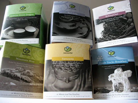
Project 2 Highlight: Namasthé logo + packaging
Isabelle Ranger was looking to enter the tea market in time for the 2010 Winter Olympics so along with Tracey Gramm from Blue Halo Creative, we designed their lotus flower-like logo and packaging from the boxes right down to the tea bag tag.
I started designing die-cut and laser-cut cards in 2006 under the name Nib & Tuck. That was where my fascination with creating cut paper compositions began. That then led to creating hand-cut and plotter-cut compositions of a more artistic nature that I now create from a studio space on Vancouver’s Eastside.